5 Key Points for Creating a Powerful and Attractive Landing Page Design
A Landing Page has a unique purpose: to provide visitors with a way to perform specific actions. In other words, businesses hope that visitors to the website will take the desired actions, such as registering as a member, making a purchase, subscribing to a newsletter, or sending a message—any type of operation. So, essentially, the landing page is the primary target for traffic. It is where we want people to arrive when browsing our website: the more visitors we have, the higher the chances of converting them into website customers. The landing page may or may not be included in the entire website. If it is part of the website, it is usually located in the homepage header. To design a good landing page, there are five key points to follow. Let's take a look!
1- Clear Value Proposition
The first key point is to have a clear value proposition. We must clearly tell people what we have for them. If our value proposition is not clear and compelling enough, visitors will simply glance over and move to another website.
2- Call to Action
The second point is evident; we also need a clear call-to-action to prompt visitors to take action. We need to tell visitors what to do: click here, register here, leave your email, leave us a message, etc. If these phrases are not clear or don't stand out on the page, most likely, visitors will just browse the page without taking action.
3- Maintain Visitor Attention
Thirdly, we need to keep people focused. If we try to show them everything we have, they will become distracted while reading all the details and won't pay attention to the primary goal of the "call-to-action." Therefore, on the landing page, we must maintain visitors' attention by limiting the content to a minimum and showing only the necessary information.
4- Visual Impact
We can convey the essence of products or things not only through text but also through images, especially when it comes to web design: images are sometimes more powerful than words. If we use an image to clearly demonstrate the benefits of becoming a member after registering, it is even better. Emotional links on the website are crucial. Once we successfully establish an emotional connection with visitors, the probability of them becoming customers is high.
5- Social Proof
We need to provide some social proof on the landing page, showing who our partners are and who is using the website. People are social beings, and we, as humans, usually have this mindset: if many people are using something, then it must be good, and maybe we can give it a try too. Therefore, by adding some numbers, logos, or testimonials, we build trust in people's minds, and trust will lead them to take action.
Two Examples Are Better Than a Thousand Words
第一個例子是 Shopify 登陸頁面(您可以在此處閱讀Shopify和Woocommerce之間的區別,點選下方圖片放大)。
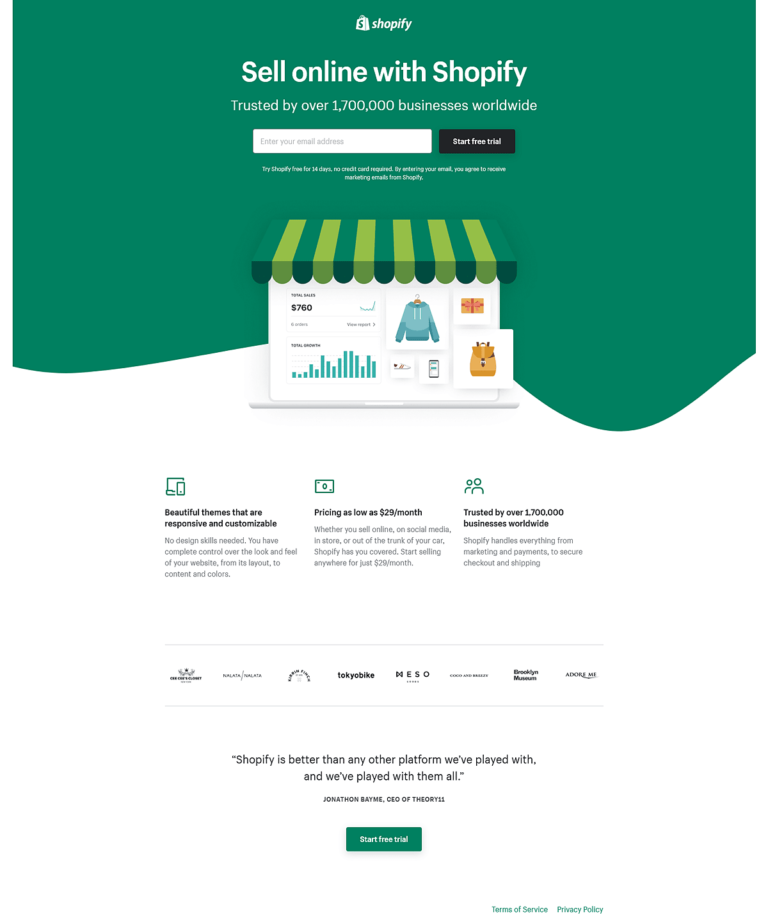
The first example is Shopify landing page (you can read the difference between Shopify and Woocommerce here) (Click the image below to enlarge).
First, please note that this is not the company's website; it is a standalone page.
Upon entering this page, the first impression is that it is very clean and quickly captures visual attention. The page has no navigation menu or links pointing to other pages; when users visit this page, they will only focus on one message.
The value proposition (main headline) at the top of the page is very clear: "Sell Online with Shopify." We understand directly and clearly what they are doing, what they offer, and what we can get.
The subheading is: "Trusted by over 1,000,000 businesses worldwide." This is social proof.
The next line is the page's highlight, asking to "Enter your email address," or more precisely, inviting to "Start your free trial." This is a very clear "call-to-action."
Continuing down to the image, it becomes easy to understand what we can do on this platform: we will manage a store, sell products, and get analytics about the sales business. These analytics images serve another purpose; they make us believe or feel that we will get professional tools.
Putting all of these together gives a clear and focused message: "You want an outstanding e-commerce website, sign up with us."
The second section below the image has more information, but it just repeats some of the previous points in a more detailed manner. First, there is a brief explanation of the features users will get, followed by some logos and testimonials to further provide social proof. The last section uses a call-to-action again, urging visitors to take action.
Please note that this page is clear, concise, and highlights the key points. It is a great example of a landing page.
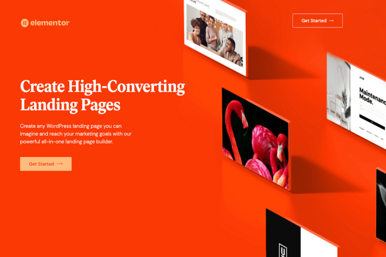
Another example is the landing page created by the team of the well-known Elementor for WordPress (Click the image below to enlarge).
Just like the Shopify example, this landing page is also very simple and focused. There are no menus or other links to distract visitors' attention; they will notice the main call-to-action of the page - "Get Started."
The value proposition headline on the page is clear: "Create High-Converting Landing Pages." So, we know exactly what it is about and what we can get.
The next sentence, "Create any WordPress landing page…," provides us with more detailed information about the previous headline, explaining precisely what tools we will get and what we can achieve by using these tools.
Next is a very simple "Get Started" button, which serves as a "call-to-action." This button is repeated in the upper right corner of the page, and this design choice helps maintain a good sense of visual balance for the entire page.
The page displays several landing page layouts, visually simple yet powerful. It clearly conveys that if we decide to subscribe to this tool, we can also create landing pages with these effects.
However, there is one point to note: this page does not include social proof. This is because Elementor is very famous in the WordPress world, and they may feel that they don't need to use this aspect on this landing page. They might prefer to keep the visual effects and users' attention as simple and focused as possible.
Conclusion
The five points we discussed above are the fundamentals of a landing page, but, of course, more information can be added. When designing such pages, the key is to remember to maintain focus, simplicity, and clarity as much as possible. Only then can we convert regular visitors into potential subscribers.


